I have mentioned before the difficulties of using a microprobe to analyze very small phases. The electron beam with which we do the analysis can, with care, be focused to about 1 micron diameter (remember that there are 1,000 microns in every millimeter). However, should the mineral phase of interest be smaller than one micron, in any dimension, the analysis will yield the composition of not just that mineral, but of whatever happens to be next to it as well.
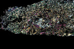
The below photo shows one of my experiments for which this was a problem. As with all back-scatter electron images the amount of brightness or darkness of any given part of the image is based on the composition of the sample in that location. Brighter areas contain more heavy elements, darker areas more light elements. The brightest grains in this image are the large pale grey crystals, which often have dark centers; these are garnets. The dark centers are the pyrope (Mg-garnet) seeds that were included in the experimental powder to give the new garnet, which is much higher in Fe (iron), a place to start growing from. The narrow stick-shaped crystals which occur in a group on the left hand side of the image are chloritoid. Unfortunately, as you can see by the scale bar on the bottom of the image, they are too narrow to obtain a good analysis. Through careful searching of the sample we found a few places where the chloritoid grains were slightly larger than the others—these were the ones we analyzed, in hopes that we would be lucky. Alas, 15 times we tried, and 15 times we failed to obtain an analysis which was only chloritoid, but instead they were "mixed" results of both chloritoid plus another phase.

How do I know for certain that they are mixed? Look at the below graphs and you can see for yourself. The upper graph shows the composition of all of those mixed analyses with respect to how much aluminum and how much silica they contain (blue-green hollow triangles). It also shows the region (grey circle) within which all of the matrix mica in this sample plots, and the location of where kyanite (Al2SiO5), also present in this sample, plots. As you can see, there is a clear trend going from the solid green triangle towards the mica, and another trend going from the solid green triangle towards the location of kyanite. The lower graph shows the trends for iron vs aluminum. By plotting this data for a variety of different combinations of elements I have come up with my best guess as to the composition of chloritoid is in this sample (solid bluish-green triangles). Is it as accurate as if I'd been able to get a good measurement? No. Does it give me information I can use when doing other parts of my data analysis? Yes, yes it does. Playing with graphs is one of the fun parts of my job—the information they convey communicates so very clearly.


No comments:
Post a Comment