Back when I first started my current research project one of the goals my boss mentioned was to see if we could determine "vectors of hydrothermal transport", or "what were the paths the hot water took as it dissolved some rock components and deposited others?". As of today, more than two years after starting this project, I finally have an answer for that for one of the ingredients in my rocks. Why did it take so long to get here?
Well, to start with, the data set the mine gave me is rather large, and the information within it was entered into the data base at a variety of different times, and the method in which the mine recorded the position of the drill holes changed at some point, so it took months to get the data "cleaned up" to the point that I could get all of the sample locations plotting in the correct space in 3D.
Then it was necessary to use "immobile element ratios" to determine what rock type each sample is. Why? Because in an area where lots of hot water flowed through the rocks picking up some elements and carrying them away while depositing others none of the rock has the same chemical composition as when it formed. However, there are certain elements that tend to stay put in the rocks, no matter how much hot water flows through it. These are called "immobile elements". Assuming that we are correct about them neither being taken away nor added to the rocks then the ratio between them won't change. However, the actual percentage of the rock that is made up of the immobile elements changes greatly. Why? Because when the other elements are dissolved and carried off that leaves a higher percentage of the “immobile elements” in the rock than it started with (but there is less rock in total). Likewise, when other elements are deposited into the rock it becomes diluted, and there is a lower percentage of the “immobile elements” left (and there is more rock than there was to begin with). In reality, both of these processes are happening at once, sometimes a bit more of one, sometimes a bit more of the other, but either way, the end result is a rock that, at first glance, looks nothing like the original rock.
However, as I mentioned above the ratio between the “immobile elements” doesn’t change. Therefore, all the rocks of the same type should plot along a straight line in a graph which has one immobile element on one axis, and another on the other. This fact is used to recognize the various rock types in the area.
Once all of the samples (more than 3,000 in my case) have been sorted into their various rock types the next step is to decide which sample within each rock type is the “least altered” sample—which one has a chemical composition that is closest to what the rock must have been before the hot water started circulating through the area?
From there, assuming that the “least altered” samples really are pretty much the same as they were to being with, it is a reasonably straightforward calculation to determine how each of the samples has changed with respect to their least altered samples. Once this has been done for every sample one has a table showing the amount of each element that was gained or lost within each sample.
This information is then taken into the 3D modelling program I am using, which looks at the location of each sample, and for a given element it can then look at how much of that element each sample gained or lost, and then it goes a step further and makes an educated guess as to how the areas between the samples must have also changed, assuming a regular pattern.
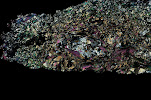
I have been at this stage for a while now, and have created lovely figures showing which areas had the greatest gain in a given element, which adjacent areas had slightly less gain, which areas had no change, which areas had a little loss of that element, which areas had a greater loss, and so on.
But what I didn’t have was the “vectors”—the nice little arrows one can draw to say that the highs are here, and the lows are there, and this is the path from here to there. Today, at long last, I discovered a way to get that using the 3D drawing capabilities within the program. “All” one has to do is first rotate the full 3D models around on the screen, setting the various layers to various states of transparency, until one is satisfied one knows where one wants to draw the line.
Then add a “plane” to the screen that goes through the area one will want to draw the line. If it happened to appear in the correct spot in the first place, rejoice. However, it is more likely that it will need adjusting. There are several options for this—one can grab one of the “handles” provided by the program, and attempt to drag the plane up, down, left, or right, until it sits where one wants it to sit (don’t forget to rotate the image on the screen and look at it from multiple directions to be certain it really is where you think it is!). This is even harder to do than it sounds. Another option is to turn off the plane and try again from the beginning. The third option is to look at the numerical coordinates for the plane and edit them. This one can be the best option. If you happen to have a sample located near where you want the center of the plane then you can click on the sample to determine its X, Y, and Z coordinates, then type those into the location of the plane. Once it is centered where you want it you can then change the dip and the dip azimuth until it is oriented correctly.
Once you are happy with the location of the plane then add the “slicer” to the screen, and edit the coordinates of the slicer until it is in the exact same position as the plane. Then you can rotate the screen until you are looking at the flat of the plane (and slicer). At that point it is possible to add a “poly line”, drawing it from the area with the greatest loss in that element to the area of the greatest gain in that element (note: it helps if you have first set the 3D model to have the front half removed by the slicer—that way when you look at the plane of the slicer what you are seeing is the concentric shells of the model, so that you can draw that line). Such poly lines automatically appear in the plane of the slicer, which is why those set-up steps were necessary.
Rotate the screen, did you get the line where you wanted it? Yup! Great. Go on to the next fault block and repeat the process from the beginning. Tedious? Yah. Cool to be able to add lines in 3D? Absolutely!
One more goal achieved, and the clock is ticking—the project officially ends with the end of this year…
Maps at the Library of Congress
4 days ago


No comments:
Post a Comment